


SABA New Arrivals, Sorted by Colour Season
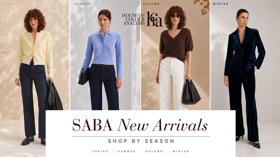
Shopping new arrivals can be exciting, but it can also be surprisingly easy to lose track of what will actually work in your wardrobe.
A beautiful colour might catch your eye, or a piece might look incredible on the model, but that doesn’t always mean it’s the best choice for your colouring.
That’s where knowing your colour season can make things much easier.
For this Shop by Season edit, I’ve gone through SABA’s latest pieces and selected some of the colours and styles worth a closer look for Spring, Summer, Autumn, and Winter.
Think of it as a helpful starting point rather than a set of rules — a way to narrow down the options and focus on pieces that are more likely to feel at home in your palette and your wardrobe.
First Things First: Don’t Shop the Model, Shop the Colour
This is something I remind clients of all the time. A piece can look incredible in a campaign image and still not be the most useful addition to your wardrobe.
Before falling in love with the styling, look at the colour itself.
Is it warm or cool? Soft or clear? Light or deep?
Those little clues can help you decide very quickly whether something deserves a closer look.
And there are some really lovely seasonal options in the current SABA selection.
Spring: Fresh, Warm and Easy

There are some really lovely Spring moments in this SABA edit.
I especially like the warm ivory tailoring and buttery yellow knits because they show that neutrals don’t always have to mean black, grey or stark white. For Spring, lighter and warmer shades can give you those easy wardrobe basics without losing the freshness of the palette.
The clear red is another standout. A good red can be beautiful on Spring when it feels lively and warm rather than dark or muted.
And don’t overlook the print. Instead of analysing every colour individually, look at the overall effect — does it feel warm, fresh and full of life? That’s often a much easier way to assess a print.
Spring Picks:
Summer: Soft Colour Without Feeling Washed Out

If you’re a Summer, this edit is a good reminder that soft doesn’t have to mean boring.
The pale blues, lilac and pinks are gentle without disappearing, while the slightly deeper cool blue adds another option if you want more colour.
I also really like the grey check. Prints like this can work beautifully for Summer because they add interest without relying on very bold contrast.
Summer Picks:
Autumn: This Is Where the Texture Gets Good

Autumns, this edit has some beautiful depth.
The chocolate and camel knits immediately feel at home in an Autumn wardrobe, while olive and burgundy bring in richer colour without becoming overly bright.
I also love the brown-and-turquoise print. It’s a great example of why you shouldn’t judge a print by one colour alone — the warm brown background changes the overall feel completely.
Autumn Picks:
Winter: Clean, Strong, and a Little Dramatic

Winter is where we can let stronger contrast come back in.
The deep navy pieces give you plenty of depth without always reaching for black, while the emerald knit brings that beautiful clear colour Winter can carry so well. Deep burgundy is another lovely option here, especially when it has that rich, cool depth rather than feeling warm or earthy.
The prints are worth noticing too — darker backgrounds paired with clearer, lighter details can feel much more at home in a Winter wardrobe than something very blended or muted.
And then there’s the navy velvet blazer. That one can have its own moment.
Winter Picks:
The Piece Doesn’t Have to Be “Perfect” for Your Season
One thing I don’t want these edits to become is another set of shopping rules.
If you absolutely love something, wear it.
Colour analysis is there to make shopping easier, not to make you afraid of choosing the “wrong” top.
What I find much more useful is asking: "Will this colour work with the wardrobe I’m already building?"
Because when your new purchases connect naturally with your existing colours, you don’t have to keep buying extra pieces just to make one new item work.
That’s where knowing your palette becomes incredibly practical.
Before You Add to Cart…
Here’s my quick check:
Would I wear this with at least three things I already own?
If yes, great.
If you’re already thinking, “I’ll just need new trousers… and maybe different shoes… and probably a jacket…”
That gorgeous top may be about to become a very expensive top.
Your best purchases are usually the pieces that make your existing wardrobe more useful, not more complicated.
See Something You Love?
You can browse the full SABA Women’s New Arrivals collection and use your seasonal edit above as a starting point. SABA’s current women’s range includes new pieces across categories such as tops, knitwear, jackets, dresses and more. Shop SABA new arrivals here.
And if you’re still looking at all four edits thinking, “I genuinely have no idea which one is mine,” that’s where a Personal Colour Analysis can help.
Once you know your palette, shopping becomes less about guessing what might work and much more about recognising your colours when you see them. Learn more here.
Yours in style,


